Invisible Design: Why the Best Remodels Are Hiding the Good Stuff
We live in a world where design used to scream, “LOOK AT ME.” Overbuilt crown molding. Chunky baseboards. Cabinet hardware that looks like medieval weaponry. But modern design isn’t loud—it’s surgical. Invisible design isn’t just a trend; it’s the next-level flex. Clean lines. Flush finishes. Details that disappear so the space itself can breathe.
It’s not minimalism for minimalism’s sake. It’s craftsmanship so good, it doesn’t need to shout.
Here’s how the pros are pulling it off.
1. Flush Baseboards & Trim: Clean Lines, No Clutter
Chunky baseboards are relics of an era when we built everything bigger to prove we could. But in modern remodels, less is truly more. Flush-mounted baseboards and trim are integrated directly into the wall, creating that uninterrupted, gallery-like plane. It’s sleek. It’s architectural. And it makes your walls look like they were sculpted from a single slab—not slapped together with MDF, caulk, and hope.
The result? A space that feels custom-built, deliberate, and impossibly clean.
2. Hidden Hinges: The Door Hardware You Don’t See
Exposed hinges are the design equivalent of visible tan lines—rookie move. Concealed hinges, on the other hand, allow doors to function as smooth, uninterrupted panels. Whether it’s cabinetry, closet doors, or even interior passage doors, hidden hinges create a seamless look that feels custom, even futuristic.
It’s a small detail that instantly elevates the entire room. The only people who’ll notice them are the ones who appreciate craftsmanship. And that’s exactly the point.
3. Seamless Cabinets: Handle-Free, Hassle-Free
Cabinet hardware is optional in 2025. Today’s high-end kitchens and bathrooms are going handle-free, opting for integrated grooves or push-to-open systems. The result is a wall of cabinetry that looks like architecture, not furniture.
No knobs. No pulls. No distractions.
It’s the difference between a nice kitchen and a kitchen that looks like it belongs in Architectural Digest. And it’s not just about aesthetics—it’s about creating a tactile experience. Cabinets you push, pull, and glide open with ease. Function meets form, with zero visual clutter.
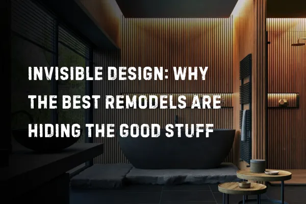
4. Shadow Gaps: The Secret to Floating Walls
Ever been in a space where the walls seem to float? Where there’s no chunky baseboard, no crown molding—just a perfect, thin line where wall meets ceiling or floor? That’s a shadow gap.
Shadow gaps are the hallmark of invisible design. They require razor-sharp precision because there’s no trim to hide imperfections. Every cut, every joint, every transition has to be perfect. No exceptions.
It’s the difference between a space that feels mass-produced and one that feels sculpted. But be warned—if your contractor isn’t a perfectionist, shadow gaps will expose them faster than a botched haircut.
5. Less Material, More Precision
Invisible design isn’t about doing less work. It’s about doing it better. It’s about precision that borders on obsessive. Flush details, hidden hardware, and seamless finishes don’t give you the luxury of hiding mistakes behind decorative flourishes. Every line has to be perfect. Every edge has to be deliberate.
This is craftsmanship with no safety net. There’s no room for shortcuts, no room for “good enough.” Invisible design demands a level of execution where perfection isn’t a goal—it’s the baseline.
The Takeaway
Invisible design is subtraction done right. You don’t need ornate trim to impress. You need flawless execution, an eye for subtlety, and the guts to let your home’s architecture do the talking.
This is design for people who know that real luxury doesn’t shout. It whispers.
But when it’s done right? That whisper is deafening.
